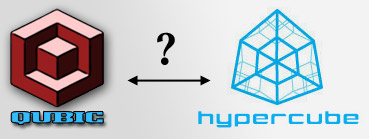
When I first received the notice from Nissan about the cube® contest, I couldn't help but notice some similarities between the hypercube branding and my own Qubic branding... cube-like name, cube-within-a-cube design, and even one of the colours (blue) is used in both designs.
Coincidence?! Perhaps more like a sign... a little carrot and a bit of a nudge to persuade me to enter this social contest.
I created the Qubic brand when I first started my hobby in music production back in Jan 2008. The word Qubic is a combination of a couple of words and concepts.
First, the word cubic means having the form of a cube but is also associated with cubic metre, which is a measure of volume (gas, liquids, solids). But another meaning of volume is a measure of loudness of sound.
Second, the word cue, which means a signal to begin an action, as in cue the music to start, or cue an actor to begin a scene.
Third, the word queue is associated with cue between some languages, and means to wait in line or line up single file. Although it has some association with music (create of set of songs which are played in sequence could be considered a queue of songs), it is more relevant to my career as a Software Developer, where data and data records are queued for processing. The music production work that I do is performed on digital files, so this had some relevance to me.
Thus... cubic + cue + queue = Qubic
For the logo design, I played on the cube idea from cubic. Playing with 3D cubes of different sizes and orientation produced a very interesting 3D optical illusion of cubes.
Is the center cube in or out? If you stare at it long enough, you'll drive yourself batty.


1 comment:
cerebral and creative-love it-u go
Post a Comment